 Sahil Chaturvedi
How does the bitcoin source code define its 21 million cap?
Many of bitcoin’s staunchest critics have expressed doubt about its 21 million cap, but perhaps the most mindless criticism relates…
,
First published: 03/30/2022
| Last
updated: 01/12/2023
| -- min read
We stand by an open-source ethos in building our software, and in that same spirit, we want to openly document some of the product and engineering challenges we face (and how we solve them!). Here we’ll cover an issue common to many organizations like ours: creating consistency in fonts and colors. It was a foundational problem to solve before we could build a robust, world-class design system that lives up to our brand as a premier bitcoin financial services firm.
When designers and engineers aren’t on the same page with a consistent library of color and text styles, communication becomes ineffective and painful.
In our case, designers were handing off specs with inconsistent colors and fonts. Engineers were manually pasting in hex codes, second-guessing the styles we were supposed to use, and sometimes using a color picker to make rough estimations. We were building a dissonant mix of old and new visual elements—far from the organized structure we needed.
Product and engineering teams know how difficult it can be working with a jumbled mess of hex codes for colors. You might be familiar with how our colors looked after years of lacking a clearly-defined process. Our fonts had similar issues.
And this was just the beginning of the problems. Without a set of primitive color and text styles that our engineers and designers could agree on, lots more problems arose across many categories important to our company and product:
We had a lot of design handoff being left to the imagination of the developers, and it was clear that something needed to change. We needed a foundation for fonts and colors, and to do this, as Jordan says in the tweet below, we needed to find a way to minimize the need for clarifications between design and developers.
In summary: perhaps a goal of design handoff should be to try and reduce the amount of clarifications and back and forth with your developers.
Leave as little as possible left to the imagination.
— jordan singer (@jsngr) December 1, 2021
Like a strong economy is built on a foundation of hard money, a strong product is built on a foundation of clear, consistent, and effective UI primitives.
With that in mind, we defined what the team needed from such a system:
This project aimed to build a color and text style system that translates well for engineers, is future-proof and extensible, and generic enough to be open-sourced.
We also needed to define who this project was for—and what goals we had for each target audience.
We addressed three categories of people with this initiative: clients, engineers, and designers. For those three categories, we set unique goals.
Now, it was time to get to work.
The first step in cleaning your room is an inventory check: what’s the current damage? Brad Frost calls this an interface inventory, or “a comprehensive collection of the bits and pieces that make up your interface.”
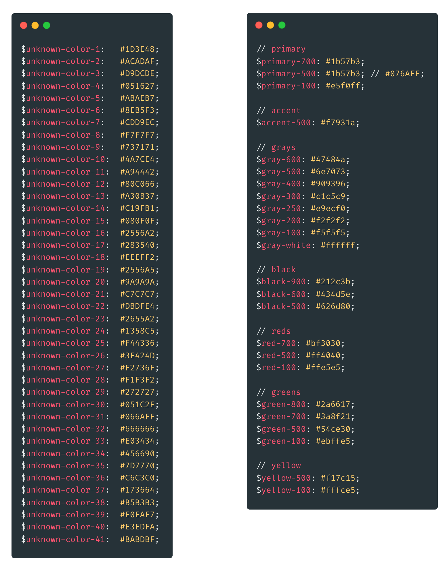
For this project, that meant identifying and building a collection of existing fonts and colors to consolidate. We used a combination of Figma and a spreadsheet to document screenshots, hex codes, and font styles for every single one of our existing colors and fonts.
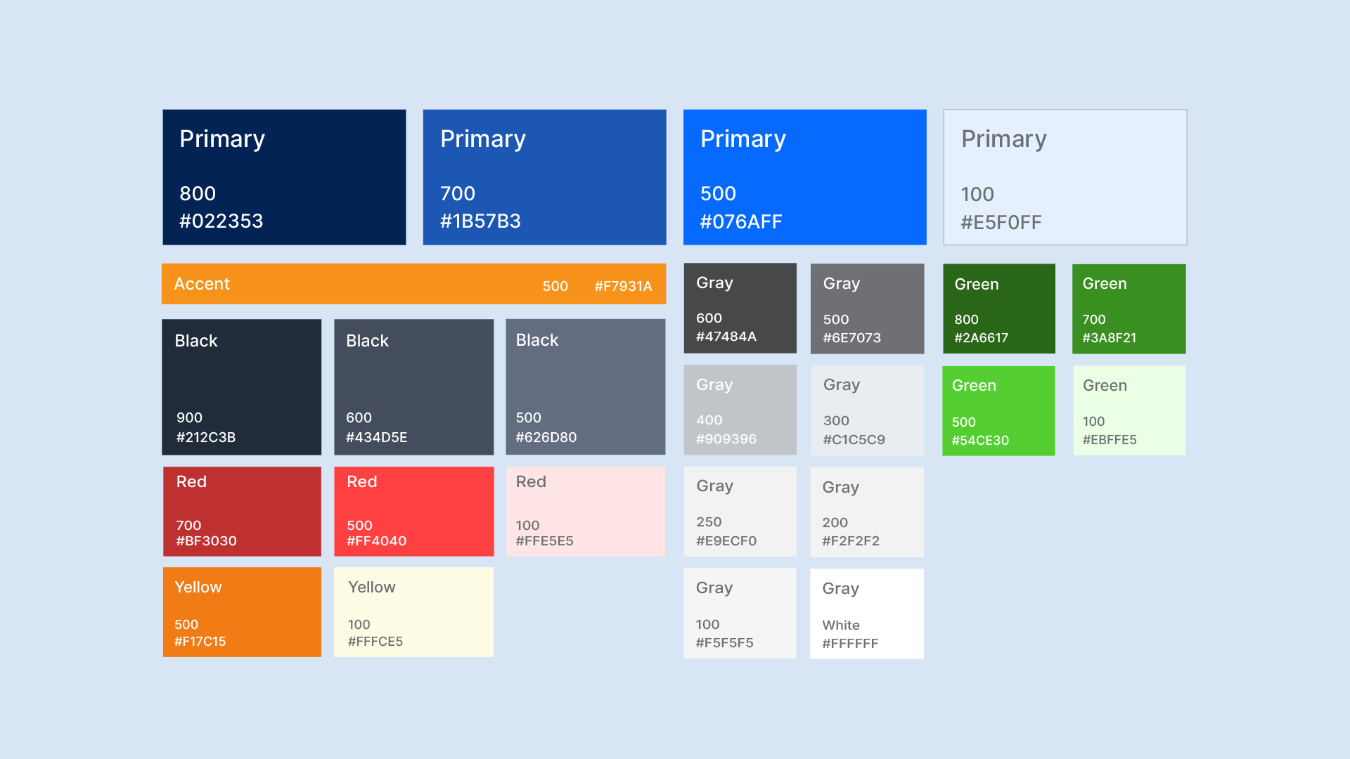
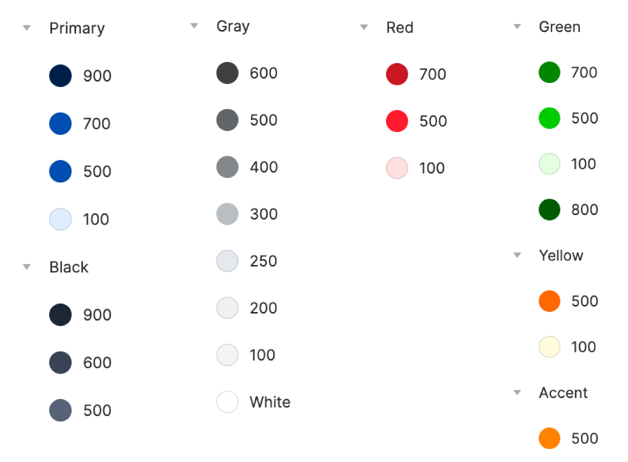
Once we had the big picture of styles already in use, we ruthlessly consolidated similar styles until we landed on an appropriate number such that we didn’t lose any functionality. We wanted a healthy range of colors, but those options had to be distinct enough to have a clear decision tree based on functional use-cases. We selected a consolidated set of primary, accent, and neutral colors with that constraint in mind, which evolved organically from our key brand colors.
One of the challenges we faced was that the brand colors weren’t optimized for web product design. We chose to find some core colors that worked well with our brand blues, while complementary colors for things like semantics and notifications were hand-picked. We also knew our color system would grow in the future, so we didn’t expand our palette beyond this in this update.
The next step was to coalesce around a primary typeface for the product. We evaluated a couple dozen fonts by testing them on key screens (like our homepage) to see if they were functional and fit our brand voice.
We chose Inter because it is flexible, open-source, and has a good family of font weights. Inter supports specific monospaced variants that are important for tables (like a table of bitcoin balances), and we also needed a font that worked well with Bitter (a complimentary serif font we chose).
Once we selected the initial set of colors and fonts, we needed a way to communicate these style tokens quickly. We investigated a couple of different naming structures:
The first option we considered was naming colors based on their function or use-case (e.g. #C1C5C9 (light gray) = disabled, #FF4040 (bright red) = destructive). In some cases, this kind of naming can be overly restrictive and inflexible—if a color with a functional name had to be changed, you’d have to change the hex code manually.
For example, if #C1C5C9 (light gray) meant “disabled,” but we also wanted to use #C1C5C9 for a background color for a surface, things could get confusing for everyone involved. This approach also requires thinking of a large set of use-cases beforehand.
We could also take inspiration from Atlassian’s design system and name fonts and colors with identifiable weight numbers with enough of a gap between weights to be flexibly expanded. For example, if we wanted to add a shade of green between green-500 and green-700, we could create green-600! Our design system is still in its early stages, so this more flexible option was the one we decided to embrace for our color naming.
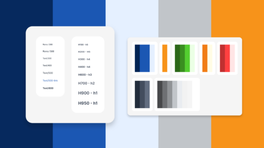
An issue that engineering identified early on was the role of HTML semantic tags (e.g., h1, h2, h3). Defining a style called h900 is well and good, but without setting sensible defaults, two different engineers may have different opinions on how to structure the page with HTML elements. This also poses a problem with screen readers. Again, design handoff breaks down when you leave a lot up to the imagination of the developers.
Design needed to account for this, so we set defaults in Figma by naming styles as h900 – [h1 default]. Engineers use these defaults to set a default stylesheet for the HTML elements and only have to apply custom styles if explicitly asked. A hacky solution, but it works so far.
Ideally, there would be a way to have functional/semantic style names inherit weighted names. That way, we would get the best of both worlds—functional, understandable, semantic names that inherit from swappable, predefined colors with easy-to-use weighted names. (e.g., “destruction” inherits red-500 but can easily be changed to inherit red-700 if needed in the future). This is not feasible natively in Figma yet, but it’s certainly something we would opt for if we could.
An update of this magnitude that touches every part of the product naturally implies a manual process of trial and error. It was particularly challenging because there were few existing reusable variables that we could quickly update. That makes sense—it was the exact problem this project was trying to solve.
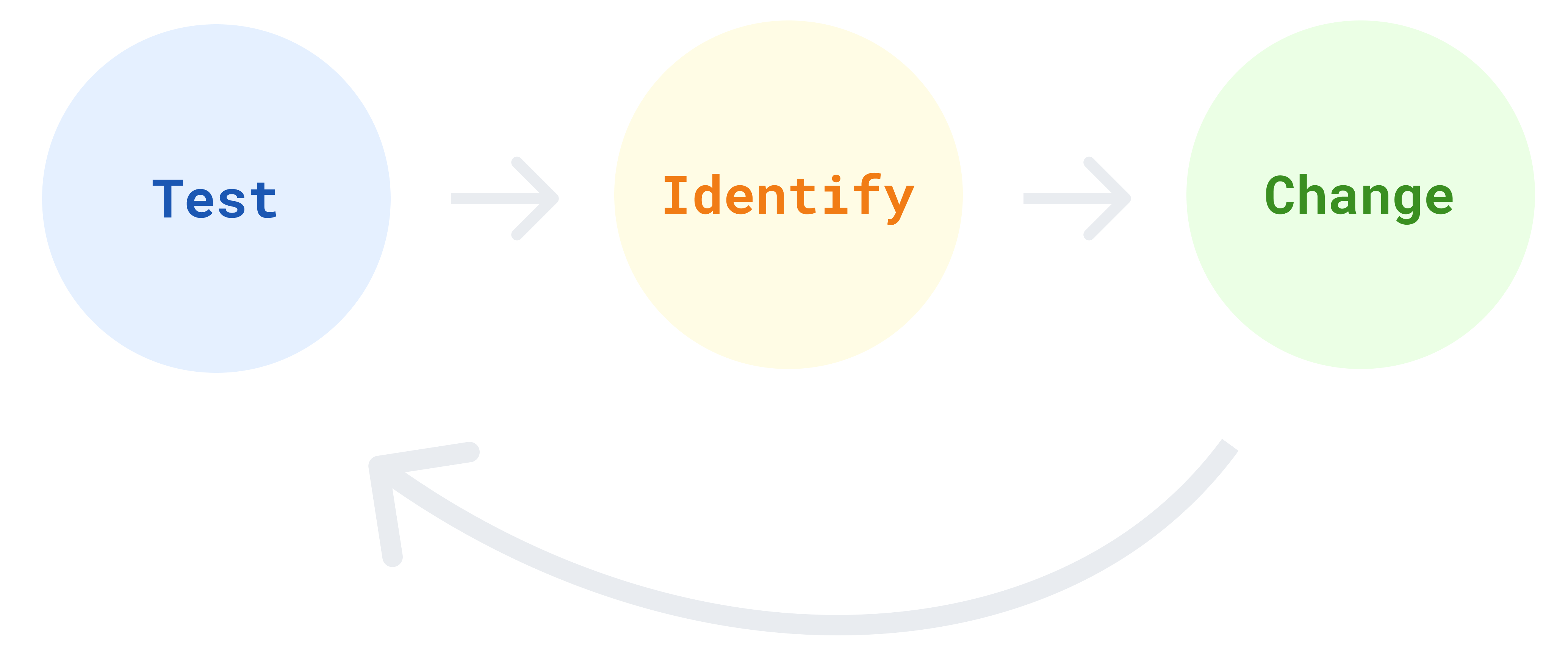
The testing phase was an intentional process of going from ignorance to awareness. This step aims to actively scour the app and discover the broader issues that the color and fonts update was designed to address. Once we found an issue, we needed a tool that would allow us to drill down deeper and reduce friction from the change-request process.
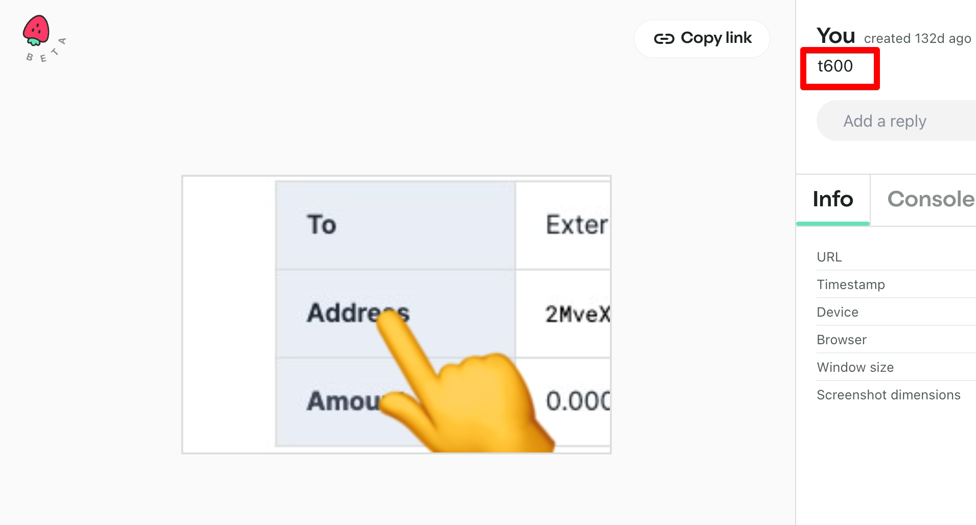
We used a tool called Jam to identify issues and communicate regarding change requests. Jam allowed us to make annotations on a live demo version of the app, which made it almost trivial for engineering to be able to identify the issue and make the necessary code change.
This still involved a lot of trial and error, investigating every user flow and screen, but it was a significantly better experience than the alternative—that is, making a large spreadsheet and manually typing out the pages for which we needed to make changes. That just sounds painful.
Brick by brick, with every color or font change we made, we built a stronger foundation for the Unchained design system.
Once we marked a change request in Jam, the engineer would make the change in code and push it to the test environment. Finally, we loop back to the Test phase and start the process again until there we no required updates left.
The Unchained design and engineering teams now have increased clarity with which to do our work, and we’re saving product and engineering lots of time. And just like putting on your nicest suit before an important business meeting, a product must “dress the part” to increase customer confidence. This is especially the case with a bitcoin-native financial services institution.
This kind of flexibility is already becoming useful in our daily workflow. One example: When working through these updates, we found that both shades of black and certain text styles were named text-500. Engineering quickly and correctly identified this confusion, so we changed the color text-500 to black-500 without further disruption. Easy!
We can extend this idea to complete rebrands or updates to our primary, secondary, and accent colors. All we’ll need to do is change the colors in a central location, and the change will ripple throughout the app.
This project was a big first step in building the foundation for our design system, but there are still some improvements we can make. The grays in our color palette could use some more definition and expansion, and as discussed previously, it would be great to have tokens that are semantic names that inherit weighted names. This is just the beginning for colors and fonts—we’ll iterate as we go and keep you updated!
Next, we’ll be building out and documenting reusable components, patterns, and behaviors to continue the effort of unleashing creativity through consistency.
Unchained is hiring. Check out our job listings if you want to help people secure their future with bitcoin and make the most of that wealth with our premier suite of financial services. Our design team’s mission is to simplify multisig bitcoin self-custody for non-technical users.
Many of bitcoin’s staunchest critics have expressed doubt about its 21 million cap, but perhaps the most mindless criticism relates…
,When Satoshi Nakamoto created bitcoin, he established in its code a fixed number of bitcoin that will ever exist. Since…
Originally published in Parker’s dedicated Gradually, Then Suddenly publication. Bitcoin is often described as a hedge, or more specifically, a…